Redesigning Google: How Larry Page Engineered a Beautiful Revolution
Redesigning Google: how Larry Page engineered a beautiful revolution
By Dieter Bohn and Ellis Hamburger
Something strange and remarkable started happening at Google immediately after Larry Page took full control as CEO in 2011: it started designing good-looking apps.
Great design is not something anybody has traditionally expected from Google. Infamously, the company used to focus on A/B testing tiny, incremental changes like 41 different shades of blue for links instead of trusting its designers to create and execute on an overall vision. The “design philosophy that lives or dies strictly by the sword of data” led its very first visual designer, Douglas Bowman, to leave in 2009.
More recently, however, it’s been impossible to ignore a series of thoughtfully designed apps — especially on iOS, a platform that doesn’t belong to Google. Google+, YouTube, Gmail, and Maps are consistent and beautiful — in stark contrast both to Google’s previous efforts and even Apple’s own increasingly staid offerings.
We went to Google looking for the person responsible for the new design direction, but the strange answer we got is that such a person doesn’t exist. Instead, thanks to a vision laid out by a small team of Google designers, each product team is finding its way to a consistent and forward-looking design language thanks to a surprising process.
They’re talking to each other.
Project Kennedy lifts off
“What might a cohesive vision for Google look like?”

The Bravest Man in the Universe, a Mobile Chrome Experiment featuring the music of Bobby Womack, created by B-Reel.
When Page took office, his first directive was clear. “Larry said ‘hey everyone, we’re going to redesign all of our products,’” recalls Jon Wiley, lead designer on Google Search. Wiley and co had just two months to give Google a fresh coat of paint, and to start thinking holistically about how Google as a whole was perceived. “We had a mandate to make this all look good,” Wiley says.
It wasn’t the first time that Google’s designers had tried to unify the design language across multiple products, but it would turn out to be the most successful by far. “Historically at Google there were pockets of designers that said ‘let’s bring all of Google together into one beautiful, amazing design,’ but because of the way Google is set up — for speed — […] it was hard for any one team to push that Google-wide,” says Wiley. It’s not that there weren’t designers at Google before, it’s just that they weren’t moving in the same direction and they didn’t have as much authority as they needed.
“When I joined Google five years ago, there was no such thing as a common design language for our platform,” says Andrey Doronichev, Senior Product Manager for YouTube Mobile, “we always wanted to create beautiful applications, but our priorities were different.” A Google-wide design initiative “required the vision of a CEO,” says Wiley, “who could rally the entire company to make it happen.” Wiley codenamed Google’s new design direction Kennedy — a reference to Page’s now-famous “moon shot” strategy for thinking up new products.
Google’s senior designers gathered to decide how a few design principles would be applied evenly and tastefully to dozens of products used by over a billion people. There was also some “outside help” from Google Creative Lab, as Wiley described in a 2011 talk entitled “Whoa, Google has Designers!” Google Creative Lab is a collection of top-tier designers in the company’s New York offices, mostly known for creating unique and emotionally compelling marketing projects like a tear-jerking Super Bowl ad or the innovative Arcade Fire music video. Page tapped Creative Lab to work with the rest of Google’s designers on creating the new vision. Unlike Apple, Google is willing to work with outside parties on design, and that played a role in the creation of Kennedy. “What might a cohesive vision for Google look like?”, Page asked them.
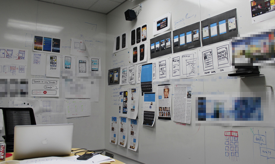
“We had a mandate to make this all look good.”The vision would turn out to focus on on refinement, white space, cleanliness, elasticity, usefulness, and most of all simplicity. “At Google we want to move fast, so a lot of these various products grew up on their own,” says Wiley, and so before Kennedy they didn’t abide by one design standard across the board. “We had a lot of simple and useful products,” Wiley says, “so we turned our focus towards making these products more beautiful, but also more consistent as a suite of products.”
Creating a design vision is the first step, but the product designers had to distill and implement it. “We sat down, locked ourselves in rooms, and we just refined on this design as quickly as we could,” Wiley said in 2011, “[we] created these reference set of designs and then set those onto the world through the ‘productionizing’ of that with the engineering teams.”
At the end of June 2011, just under three months after Page took over as CEO, Google shipped fresh new versions of Google Search, Google Maps, and Gmail, and Calendar. In the next year and a half, Google moved swiftly, launching Google Now, a fresh mobile take on Kennedy ideals, and a host of stunning new iOS apps like Google+, YouTube Capture, Chrome, and Maps that followed much of the original vision, albeit with some variations between the different product teams. What was once Brownian Motion, as Wiley describes it, was now a flowing stream of design ideals with forks along the way, but all heading in the same general direction.
Matias Duarte, senior director, Android user experience, put it this way: “Google is going through a design revolution, for lack of a better word.”
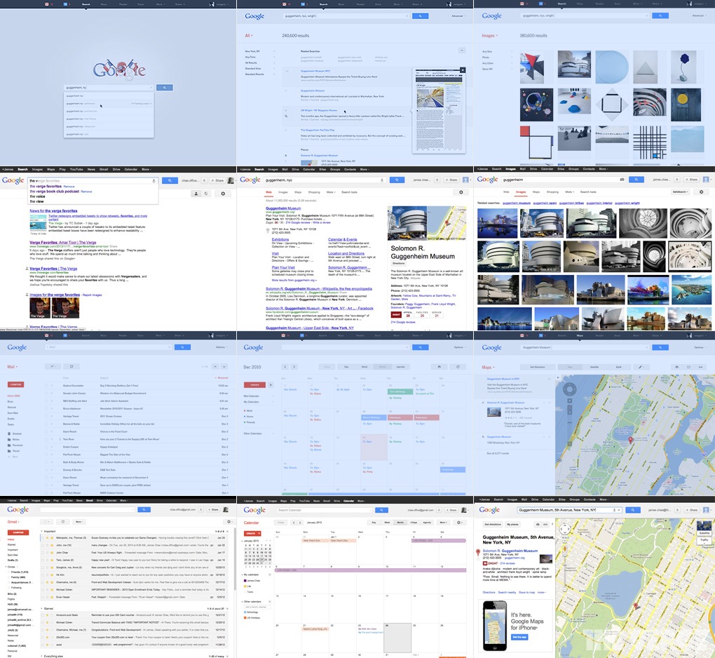
A comparison of current Google products to design explorations by Andy Gugel, Jesse Kaczmarek, and Google Creative lab created in 2010 (blue).

Every designer we spoke to at Google repeated variations on the same message: “There’s not one person who’s the grand leader of design at Google,” Wiley says. Doronichev repeated the message: “We don’t have a single mastermind designer.” Google may not have a Jony Ive, but there is nevertheless a coherent process for laying out a design vision across all these multiple teams and platforms.
Doronichev says that “it’s all about teams iterating together and sharing information, and making sure we end up in a sweet spot where our design language is very similar, fits well into each platform, but at the same time keeps being Google.”
This doesn’t just naturally arrive out of regular collaboration around the office. To help make it happen, there’s a small group of a few designers in New York called Google UXA. It’s a relatively secretive group, its web footprint limited to just a few job listings, but the size of its presence at Google almost can’t be overstated. The UXA team, born out of the Kennedy Project, works on “designing and developing a true UI framework that transforms Google’s apps into a beautiful, mature, accessible and consistent platform for its users” and focuses on keeping that vision consistent across all of Google’s products.
UXA works with all of the lead designers for Google’s most important products on a regular basis. But its small size and even smaller public face makes it unique, and in fact may help the core design team work better with the rest of Google, where collaboration between teams is the name of the game. In fact, Google doesn’t publicly mention UXA by name, including in our interviews with their designers. Creative Director Chris Wiggins’ blog post announcing the first Kennedy redesign mentions plans for “a series of design improvements across all our products,” but beyond such subtle hints the team stays under the radar.
Essentially, you can think of UXA as taking the structure that was put together for the rapid, three-month Kennedy project and turning it into a Google institution. And like any true Google institution, the way its work turns into actual product is a curious mix of informality and relentless work ethic. Speaking more generally about how design meetings go at Google, Wiley says “We get together, we have lunch, and we talk endlessly.”
Darren Delaye, lead designer on Google Maps for Mobile, told us that designers for various iOS apps have a “casual get-together, but on a very regular basis, to talk about feedback we have for each other and things we’ve tried.” That’s not to say that these design meetings dictate the final look and feel for apps, but they seem to act more as a guide. “Designers take the design language from cross-product initiatives like Kennedy and weave that together with the user needs for their particular product,” Wiley explains.
The goal is to “balance the experience across all Google products with the need to move fast and deliver great solutions for our users,” and to that end, each product team acts indepently to ship its app. You’ll see small variations between specific implementations, but since Google has institutionalized this new approach, each app — finally — looks like it belongs in the same family.
Jon Wiley, lead designer on Google Search
Think of UXA as taking the structure that was put together for the rapid, three-month Kennedy project and turning it into a Google institution
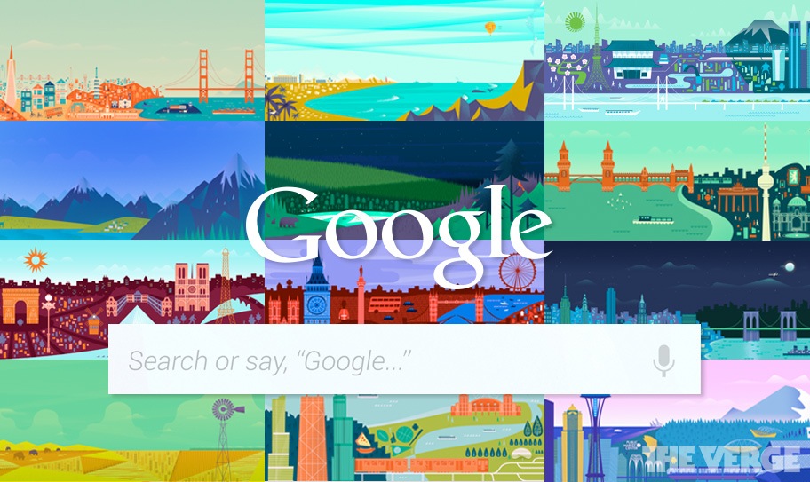
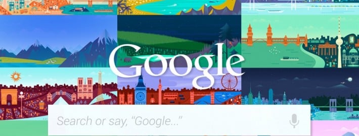
The Google design team explored a wide range of options for the contextual background on Google Now.

You can see yet another example of Google’s design process in the development of Google Now on Android. An incredibly ambitious new product, Google Now “started as a twenty percent project,” as Android’s director of product management, Hugo Barra told us in October, but it became something much bigger.
“Google Now is a great example in so many ways to talk about design and the rise of design culture and the way that design works at Google,” says Duarte. The Google Now team needed to take many different Google features and combine them into an interface that could “feel like it’s a natural extension of Android without losing any of the Googleness.” To do it, the Android team followed the same process that the web team did with Kennedy: they collaborated across the entire company.
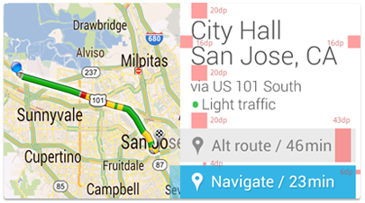
We worked very closely with Jon Wiley’s search team because they were really building a big part of what Google Now was — the knowledge part. We worked closely with the Android team in London that was working on the speech stuff. And we had an Android team here in Mountain View that was understanding your location. We got together in this giant war room and just churned and mashed and just iterated, trying to create the simplest possible experience.
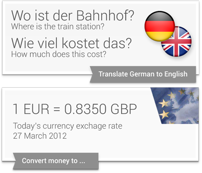
Duarte stressed the importance of typography in “expressing the knowledge and answers” Google Now serves up. “A lot of use of white space, not a lot of artificial, surface-like divisions. We’re really counting on bold typography, white space, and big images to give emphasis, give character and give hierarchy to the cards that we give you.” It was a new look for Google, one that would soon propagate throughout its mobile products.
“They feel, not necessarily real, but they feel virtual. They’re not trying to be fake things, not … fake leather, fake wood, fake brushed aluminum.”The central design metaphor that Duarte and the team eventually landed on was one he’d used before in webOS: cards. The cards in Google Now also show up in Google search, when it displays “Knowledge Graph” results on the web. In both cases, cards seem to represent the information Google gives you directly instead of through a list of blue links. Cards are like a digital equivalent to the traditional architectural concept of marrying form and function — so that the way a thinglooks is inseparable from what the thing is. “These are objects,” Duarte says, “They feel, not necessarily real, but they feel virtual. They’re not trying to be fake things, not … fake leather, fake wood, fake brushed aluminum.”
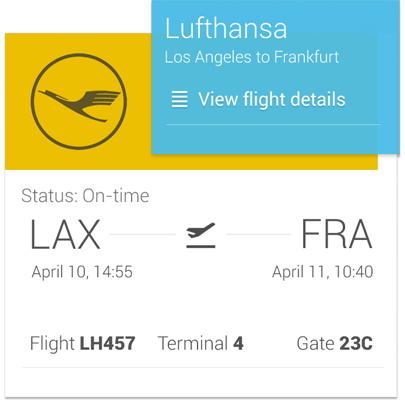
Thinking about the intersection of information and software interfaces as tangible digital objects is admittedly high-concept stuff. The actual experience of using Google Now isn’t quite so heady — the cards often aren’t exactly what you were hoping for and are still a long way off from the “shocking, provocative direction” that Page asked for. The product itself might not live up to its ambitions, but nevertheless it quickly established itself as the most forward-looking mobile design at Google at the time.
Will the design of Google Now eventually make its way into Android? It’s entirely possible. Duarte is on the record saying that Android isn’t where he wants it to be yet, “Personally I feel like I’ve gotten only about a third of the way to where I want to be with regards to consistency, responsiveness, and polish.” Duarte says that Holo, the design guidelines for Android, is more than flexible enough to handle the design cues in Google Now. Since Holo sits on “that razor’s edge of not forcing everybody to look the same, feel the same,” it simultaneously explains why there’s a little less design consistency in Android and why that could easily change soon. But while we wait to see if the rest of Android will take on the look and feel of Google Now, Google’s iOS apps are already doing it.
Matias Duarte, senior director, Android user experience
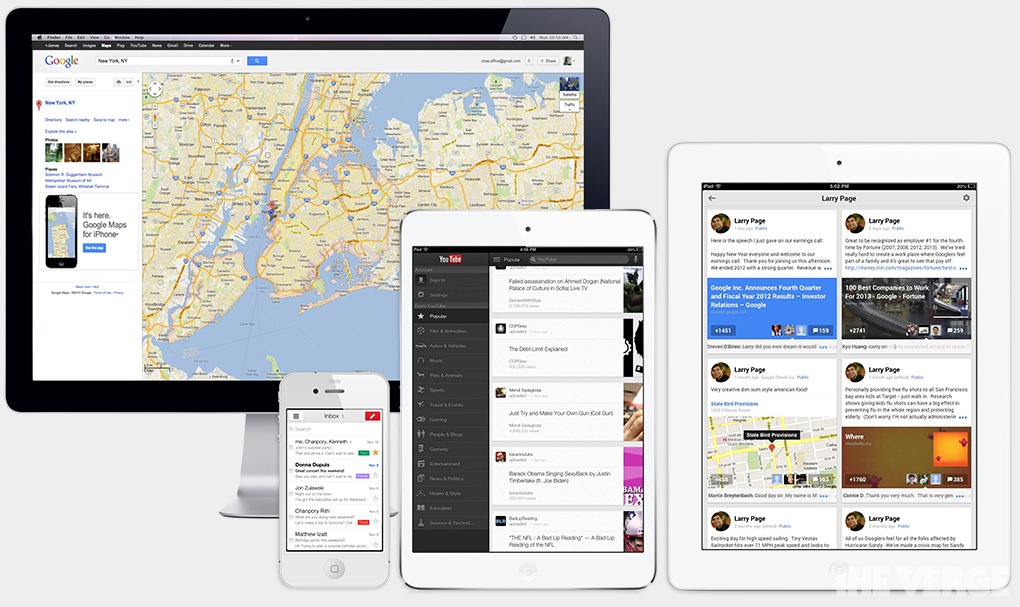
Google revamped its suite of iOS products in a short time span.
Design, distributed
Google Now’s cards, along with the original vision laid out in Kennedy, set the tone for nearly all the redesigns we saw in 2012 — modern frames for content that eschew heavy-handed drop shadows in favor of clean lines, a vibrant array of colors, and highly legible fonts like Helvetica Neue (iOS) and Roboto (Android). Cards are most visible in Google Now, but have inspired interfaces in everything from Knowledge Graph search results to Google+ profiles to Google Maps on iOS.
“How do we take what’s great about Google design and express it in many places?” Wiley asks. The resulting effect is an interface like the new Gmail web interface “which doesn’t show you things you don’t need” and focuses on simplicity. You might notice that the array of buttons like Archive, Report Spam, and Delete now only appear once you’ve selected one or more emails — a design choice that’s logical but also visually unclutters Gmail. You might also notice red “Compose” and blue “Share” buttons in many Google web products, or profile pictures, which appeared in Google+ and now find themselves next to every member of an email chain in Gmail.
Jason Cornwell, lead designer, Gmail
Google is supposed to be “born of a digital environment,” in contrast to “a trend to create things representative of physical objects,” Wiley says. It’s somewhere in between Apple’s skeuomorphism and Microsoft’s sparse “Metro” design. The new Google has depth, but isn’t shiny or blingy, and has subtle design choices, shifting the focus towards content like search results, email, and Google+ posts.
The biggest challenge became designing an interface that works across all platforms — Windows, Mac, Android, and iOS primarily — while still feeling native to each. “Your inbox is a to-do list that others have made for you, and is inherently chaotic,” says Gmail lead designer Jason Cornwell. The goal is not “making Gmail look identical across the web, Android, and iOS,” Cornwell says, “but taking the elements that make those platforms what they are and marrying them with the overall conceptual direction Gmail is pushing.”
Gmail 1.0 for iOS was a haphazard and ugly webview riddled with bugs, but over time was updated regularly to the point when it evolved into Gmail 2.0 — a svelte and (comparatively) speedy application. “We took our time with [Gmail 2.0 for iOS] and really sweated the details,” Cornwell says, an attitude shared by the others we interviewed reflected. As a whole, deciding what Google apps should look like on iOS just took some time. “The mobile apps took several iterations to get right and really find our voice,” he says. “What you’re seeing is the result of a lot of back and forth between different teams to come up with what feels like a very coherent design statement across our apps.” “How do we apply the Google design aesthetic to iOS in a way that feels native?” Cornwell asks. The “spinner” animation indicating that the app is loading new content was directly inspired by Google+’s unique pull-to-refresh animation, he says.
“How do we apply the Google design aesthetic to iOS in a way that feels native?”
It’s not identical to what Google+ uses, however, and is a good small-scale example of how Google’s collaborative design process works: a designer on the Google+ iOS team comes up with a great idea, and it spreads like wildfire to other designers, and thus to other apps. Google Maps is the most recent iteration of Google’s new design direction on iOS, and it’s unique in that the Maps team had an opportunity to start from scratch. “That was a great gift in a lot of ways,” says Darren Delaye, lead designer on Google Maps for mobile. “We could experiment, iterate, and come out with something completely new.”
The result, Google Maps for iOS, is an app that includes many components of Kennedy, Google Now, and Google.com, Delaye says. “We’re using Cards, white on white, and soft shadows to separate different elements of the UI. Many would agree that Maps for iOS looks better than Maps for Android, but Delaye says the apps are two sides of the same coin, reflections of Google at different points in time. He defines the success of Maps not in how it looks, however, but in how quickly you’re able to stick your phone back into your pocket. “How many steps are there? How hard do you have to think for every step? How long do you have to wait?” Delaye added an ETA box to Maps for iPhone that appears the moment you ask for directions.
Having launched most recently, Maps is the most complete vessel for Page’s vision: a simple, useful, and aesthetically pleasing design. It embodies a new trend at Google: collaboration across platforms, teams, and applications. As each new app launches, it’s easy to see the design lessons and visual cues that carry through to the next one. “Everyone bases their work off whatever’s the freshest at Google,” says Delaye. Wiley explains that the process is actually pretty straightforward, the core cross-disciplinary design team grabs the best stuff when it makes sense: “when products launch new or interesting components that are appropriate for wider adoption, we work to build those into the overall design language.” He calls it “a feature of our open culture,” and it’s a kind of serial design that so far seems to be working.
Everyone we interviewed repeated the mantra “one simple, beautiful, useful Google” — though the order of those three words sometimes changed. Wiley says, “the different teams are creating apps that hang together as recognizable ‘Googley’ apps simply by talking to each other, not by following strict design rules.”
Notable Google design milestones
2011
April 4 – Kennedy project begins
June 28 – Google.com Search
June 28 – Google+ web
June 28 – Google Maps web
June 30 – Gmail web
June 30 – Google Calendar web
October 3 – Google Docs web
November 2 – Gmail iOS 1.0
2012
June 28 – Chrome for iOS, Drive for iOS
September 11 – YouTube iOS app launch
October 30 – Google Search app with Now cards
December 4 – Gmail iOS 2.0
December 12 – Google Maps iOS
December 14 – Google+ iOS with pull-to-refresh
December 17 – YouTube Capture
2013
January 23 – Google Image Search revamp

Google CEO Larry Page

